TENDLY: Health-tech SaaS Case Study (Designing Clarity in Patient Management)
TENDLY: Health-tech SaaS Case Study
(Designing Clarity in Patient Management)
TENDLY: Health-tech SaaS Case Study
(Designing Clarity in Patient Management)
A smarter, centralized patient dashboard that helps doctors spend less time searching and more time caring.
A smarter, centralized patient dashboard that helps doctors spend less time searching and more time caring.
A smarter, centralized patient dashboard that helps doctors spend less time searching and more time caring.
Skills:
Skills:
Skills:
UX & Product Thinking
UX & Product Thinking
UX & Product Thinking
🖌️ UI & Visual Design
🖌️ UI & Visual Design
🖌️ UI & Visual Design
🛠️ Design Tools & Systems
🛠️ Design Tools & Systems
🛠️ Design Tools & Systems
🧪 Research & Strategy
🧪 Research & Strategy
🧪 Research & Strategy
🤝 Collaboration & Communication
🤝 Collaboration & Communication
🤝 Collaboration & Communication
Project Overview
Project Overview
Project Overview
Tendly is a Healthtech SaaS platform that connects doctors and patients through a streamlined digital experience. This case study explores how I designed both web (for doctors) and mobile (for patients) interfaces to simplify core tasks like scheduling, messaging, and prescription management.
Tendly is a Healthtech SaaS platform that connects doctors and patients through a streamlined digital experience. This case study explores how I designed both web (for doctors) and mobile (for patients) interfaces to simplify core tasks like scheduling, messaging, and prescription management.
Tendly is a Healthtech SaaS platform that connects doctors and patients through a streamlined digital experience. This case study explores how I designed both web (for doctors) and mobile (for patients) interfaces to simplify core tasks like scheduling, messaging, and prescription management.
Core Challenge
Core Challenge
Core Challenge
Doctors juggle too many fragmented tools, while patients often feel disconnected after consultations. The challenge was to centralize everything: appointments, medical records, communication, and prescriptions—into one simple platform.
Doctors juggle too many fragmented tools, while patients often feel disconnected after consultations. The challenge was to centralize everything: appointments, medical records, communication, and prescriptions—into one simple platform.
Doctors juggle too many fragmented tools, while patients often feel disconnected after consultations. The challenge was to centralize everything: appointments, medical records, communication, and prescriptions—into one simple platform.
Business & Product Goals
Business & Product Goals
Business & Product Goals
Business Goals:
Business Goals:
Business Goals:
Improve operational efficiency for doctors
Improve operational efficiency for doctors
Improve operational efficiency for doctors
Boost patient engagement
Boost patient engagement
Boost patient engagement
Create a scalable B2B SaaS product for clinics
Create a scalable B2B SaaS product for clinics
Create a scalable B2B SaaS product for clinics
Product Goals:
Product Goals:
Product Goals:
Design a web dashboard for doctors to manage care
Design a web dashboard for doctors to manage care
Design a web dashboard for doctors to manage care
Design a mobile app for patients to manage health
Design a mobile app for patients to manage health
Design a mobile app for patients to manage health
Ensure seamless navigation and user trust
Ensure seamless navigation and user trust
Ensure seamless navigation and user trust
My Role as a Product Designer
My Role as a Product Designer
My Role as a Product Designer
As the sole Product Designer on this case study, I took full ownership of the design process from ideation to high-fidelity execution.
As the sole Product Designer on this case study, I took full ownership of the design process from ideation to high-fidelity execution.
As the sole Product Designer on this case study, I took full ownership of the design process from ideation to high-fidelity execution.
Defining user problems and mapping out their goals
Defining user problems and mapping out their goals
Defining user problems and mapping out their goals
Conducting competitive and UX research to validate ideas
Conducting competitive and UX research to validate ideas
Conducting competitive and UX research to validate ideas
Creating user personas and end-to-end user flows
Creating user personas and end-to-end user flows
Creating user personas and end-to-end user flows
Designing high-fidelity UI for both web (doctors) and mobile (patients)
Designing high-fidelity UI for both web (doctors) and mobile (patients)
Designing high-fidelity UI for both web (doctors) and mobile (patients)
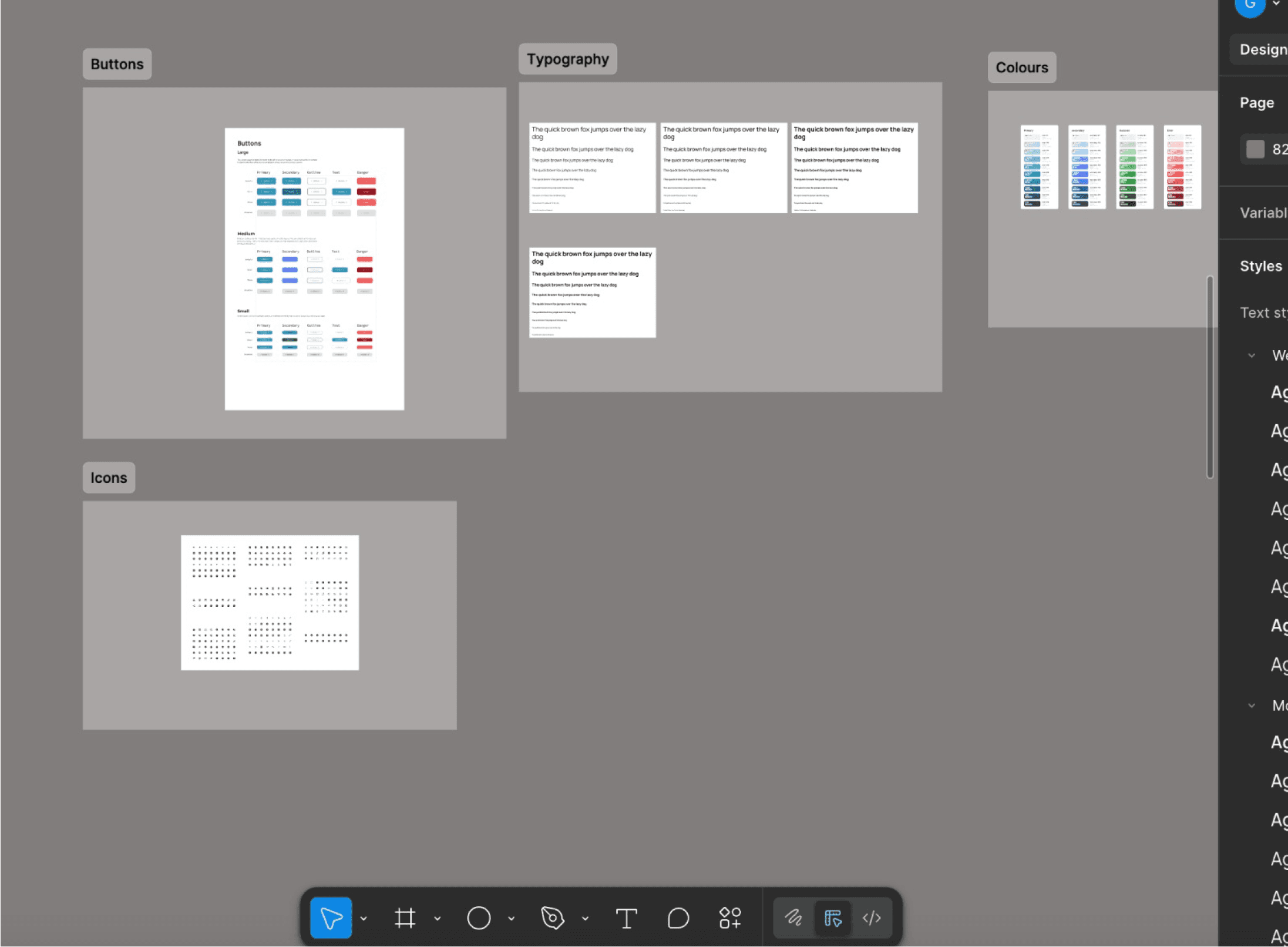
Establishing a visual design system with accessible colors and typography
Establishing a visual design system with accessible colors and typography
Establishing a visual design system with accessible colors and typography
Prototyping interactions and ensuring usability
Prototyping interactions and ensuring usability
Prototyping interactions and ensuring usability
Telling the story through documentation, social sharing, and ongoing iteration
Telling the story through documentation, social sharing, and ongoing iteration
Telling the story through documentation, social sharing, and ongoing iteration
Competitive Research
Competitive Research
Competitive Research
I explored tools like HelloDoc, Heala Clafiya, and Kangpe. While feature-rich, they often feel bulky, slow, or impersonal. This helped shape Tendly’s approach: make it simpler, faster, and user-first.
I explored tools like HelloDoc, Heala Clafiya, and Kangpe. While feature-rich, they often feel bulky, slow, or impersonal. This helped shape Tendly’s approach: make it simpler, faster, and user-first.
I explored tools like HelloDoc, Heala Clafiya, and Kangpe. While feature-rich, they often feel bulky, slow, or impersonal. This helped shape Tendly’s approach: make it simpler, faster, and user-first.
Platform
Platform
Platform
HelloDoc
HelloDoc
HelloDoc
Heala
Heala
Heala
Clafiya
Clafiya
Clafiya
Kangpe
Kangpe
Kangpe
Strengths
Strengths
Strengths
Verified doctors, EMR, scheduling
Verified doctors, EMR, scheduling
Verified doctors, EMR, scheduling
Telemedicine + medication delivery
Telemedicine + medication delivery
Telemedicine + medication delivery
Messaging lacks rich formatting / structure
Messaging lacks rich formatting / structure
Messaging lacks rich formatting / structure
EMR + telemedicine support
EMR + telemedicine support
EMR + telemedicine support
USSD & home visits
USSD & home visits
USSD & home visits
UI feels dated & complex for non-tech users
UI feels dated & complex for non-tech users
UI feels dated & complex for non-tech users
No visual interface for appointment overview
No visual interface for appointment overview
No visual interface for appointment overview
Weakness
Weakness
Weakness
Interface can feel cluttered & unresponsive
Interface can feel cluttered & unresponsive
Interface can feel cluttered & unresponsive
Key Research Insight
Key Research Insight
To design a solution that truly supports doctors and patients, I conducted research focused on real-world pain points and workflow gaps. This involved analyzing existing platforms, reviewing feedback from medical professionals, and exploring behavior patterns across digital health tools.
The goal was to identify what works, what doesn’t, and where Tendly could create meaningful value. Below are the key insights that guided my design decisions:
Doctors prefer tools that save time, not add to it.
Doctors prefer tools that save time, not add to it.
Doctors prefer tools that save time, not add to it.
Patients need clearer follow-up actions after appointments.
Patients need clearer follow-up actions after appointments.
Patients need clearer follow-up actions after appointments.
Good healthcare UX is about visibility, trust, and speed.
Good healthcare UX is about visibility, trust, and speed.
Good healthcare UX is about visibility, trust, and speed.

Samuel Adekunle
Age: 40
Occupation: Civil Engineer
Location: Lagos, Nigeria
User Type: Outpatient
Platform: Mobile
“I just want a simple app where I can book appointments, chat with my doctor, and keep track of my medications — without going back and forth to the hospital.”
Bio
Samuel is a busy professional living in the city who manages a chronic health condition (hypertension). He has regular check-ups with his doctor and occasionally needs prescription renewals. Samuel is tech-savvy, prefers digital convenience, and values platforms that save him time. He doesn’t like hospital queues or calling clinics for updates.
Goals
Avoid hospital queues and unnecessary visits
Stay on top of his medication schedule
Track his health over time and feel in control of his treatment
Get timely support and follow-up care
Build a consistent, trusted relationship with his healthcare provider
Pain Points
Long wait times and poor communication from clinics
Forgetting appointment times or when to take medication
Inability to easily access lab results or past treatment records
Lack of transparency about treatment or prescriptions
Needs
A centralized digital platform to manage appointments, prescriptions, and messages
Easy access to his medical records and treatment history
Reliable appointment reminders and medication alerts
A way to communicate with his doctor remotely

Dr. Ifeoma Eze
Age: 32
Occupation: General Practitioner
Experience: 9+ Years
Location: Lagos, Nigeria
Tech Proficiency: Moderate
Platform: Desktop
“I need a simple, centralized platform to remotely monitor my outpatients and post-surgery patients, so I can track their recovery without unnecessary in-person visits.”
Bio
Dr. Ifeoma who is a dedicated primary care physician with over 9 years of experience. She sees an average of 15–20 patients a day and balances administrative tasks, prescriptions, lab requests, and follow-up care. She’s passionate about providing quality healthcare but often feels overwhelmed by the scattered digital tools and manual processes in her clinic.
Goals
Streamline patient management from appointment to consultation.
Reduce time spent on paperwork and manual processes.
Have a centralized view of each patient’s medical history and vitals.
Spend more face-to-face time with patients instead of screens.
Pain Points
Switching between multiple platforms for different tasks (records, appointments, prescriptions).
Forgetting patient context due to poor record access.
Frequent delays due to appointment clashes or double-booking.
No easy way to manage her day at a glance.
Needs
An all-in-one dashboard for daily overview.-
Quick access to patient history, lab results, and vitals.
Simple appointment booking with reminders.
Integrated messaging to communicate with patients or staff.
Dr. Ifeoma Eze
Age: 32
Occupation: General Practitioner
Experience: 9+ Years
Location: Lagos, Nigeria
Tech Proficiency: Moderate
Platform: Desktop
“I need a simple, centralized platform to remotely monitor my outpatients and post-surgery patients, so I can track their recovery without unnecessary in-person visits.”
Bio
Dr. Ifeoma who is a dedicated primary care physician with over 9 years of experience. She sees an average of 15–20 patients a day and balances administrative tasks, prescriptions, lab requests, and follow-up care. She’s passionate about providing quality healthcare but often feels overwhelmed by the scattered digital tools and manual processes in her clinic.
Goals
Streamline patient management from appointment to consultation.
Reduce time spent on paperwork and manual processes.
Have a centralized view of each patient’s medical history and vitals.
Spend more face-to-face time with patients instead of screens.
Pain Points
Switching between multiple platforms for different tasks (records, appointments, prescriptions).
Forgetting patient context due to poor record access.
Frequent delays due to appointment clashes or double-booking.
No easy way to manage her day at a glance.
Needs
An all-in-one dashboard for daily overview.
Quick access to patient history, lab results, and vitals.
Simple appointment booking with reminders.
Integrated messaging to communicate with patients or staff.
Samuel Adekunle
Age: 40
Occupation: Civil Engineer
Location: Lagos, Nigeria
User Type: Outpatient
Platform: Mobile
“I just want a simple app where I can book appointments, chat with my doctor, and keep track of my medications — without going back and forth to the hospital.”
Bio
Samuel is a busy professional living in the city who manages a chronic health condition (hypertension). He has regular check-ups with his doctor and occasionally needs prescription renewals. Samuel is tech-savvy, prefers digital convenience, and values platforms that save him time. He doesn’t like hospital queues or calling clinics for updates.
Goals
Avoid hospital queues and unnecessary visits
Stay on top of his medication schedule
Track his health over time and feel in control of his treatment
Get timely support and follow-up care
Build a consistent, trusted relationship with his healthcare provider
Pain Points
Long wait times and poor communication from clinics
Forgetting appointment times or when to take medication
Inability to easily access lab results or past treatment records
Lack of transparency about treatment or prescriptions
Needs
A centralized digital platform to manage appointments, prescriptions, and messages
Easy access to his medical records and treatment history
Reliable appointment reminders and medication alerts
A way to communicate with his doctor remotely
User Persona
User Persona
Understanding the daily Challenges of frontline healthcare professionals to design tools that truly support their work flow.
Understanding the daily Challenges of frontline healthcare professionals to design tools that truly support their work flow.
User Persona
Understanding the daily Challenges of frontline healthcare professionals to design tools that truly support their work flow.
“I need a simple, centralized platform to remotely monitor my outpatients and post-surgery patients, so I can track their recovery without unnecessary in-person visits.”
Bio
Dr. Ifeoma who is a dedicated primary care physician with over 9 years of experience. She sees an average of 15–20 patients a day and balances administrative tasks, prescriptions, lab requests, and follow-up care. She’s passionate about providing quality healthcare but often feels overwhelmed by the scattered digital tools and manual processes in her clinic.
Goals
Streamline patient management from appointment to consultation.
Reduce time spent on paperwork and manual processes.
Have a centralized view of each patient’s medical history and vitals.
Spend more face-to-face time with patients instead of screens.
Pain Points
Switching between multiple platforms for different tasks (records, appointments, prescriptions).
Forgetting patient context due to poor record access.
Frequent delays due to appointment clashes or double-booking.
No easy way to manage her day at a glance.
Needs
An all-in-one dashboard for daily overview.
Quick access to patient history, lab results, and vitals.
Simple appointment booking with reminders.
Integrated messaging to communicate with patients or staff.
Dr. Ifeoma Eze
Age: 32
Occupation: General Practitioner
Experience: 9+ Years
Location: Lagos, Nigeria
Tech Proficiency: Moderate
Platform: Desktop
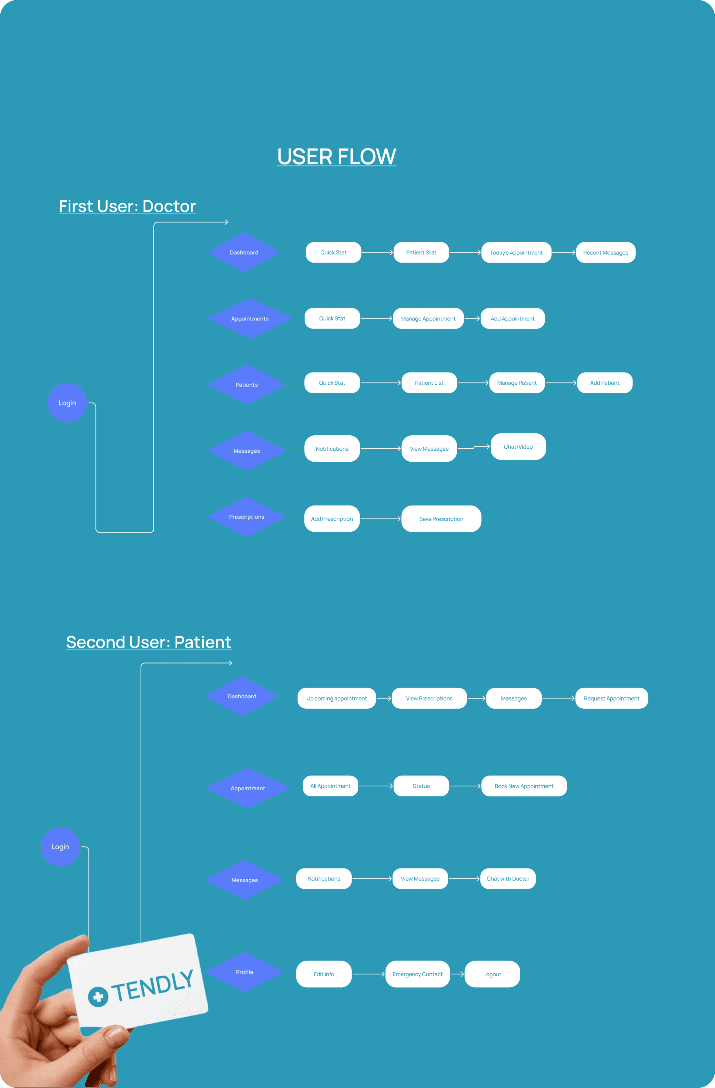
User Flow
User Flow
User Flow
I mapped out the core user journeys for both doctors and patients. Each step—from logging in to booking, chatting, prescribing, or reviewing vitals, was designed to reduce friction and support clear decision-making.
I mapped out the core user journeys for both doctors and patients. Each step—from logging in to booking, chatting, prescribing, or reviewing vitals, was designed to reduce friction and support clear decision-making.
I mapped out the core user journeys for both doctors and patients. Each step—from logging in to booking, chatting, prescribing, or reviewing vitals, was designed to reduce friction and support clear decision-making.
Core Screens & Design Decisions
Core Screens & Design Decisions
Core Screens & Design Decisions
Each screen was thoughtfully designed to support doctors and patients in achieving their goals with clarity and speed. Here's a breakdown of the core screens and the key design decisions behind them:
Each screen was thoughtfully designed to support doctors and patients in achieving their goals with clarity and speed. Here's a breakdown of the core screens and the key design decisions behind them:
Each screen was thoughtfully designed to support doctors and patients in achieving their goals with clarity and speed. Here's a breakdown of the core screens and the key design decisions behind them:
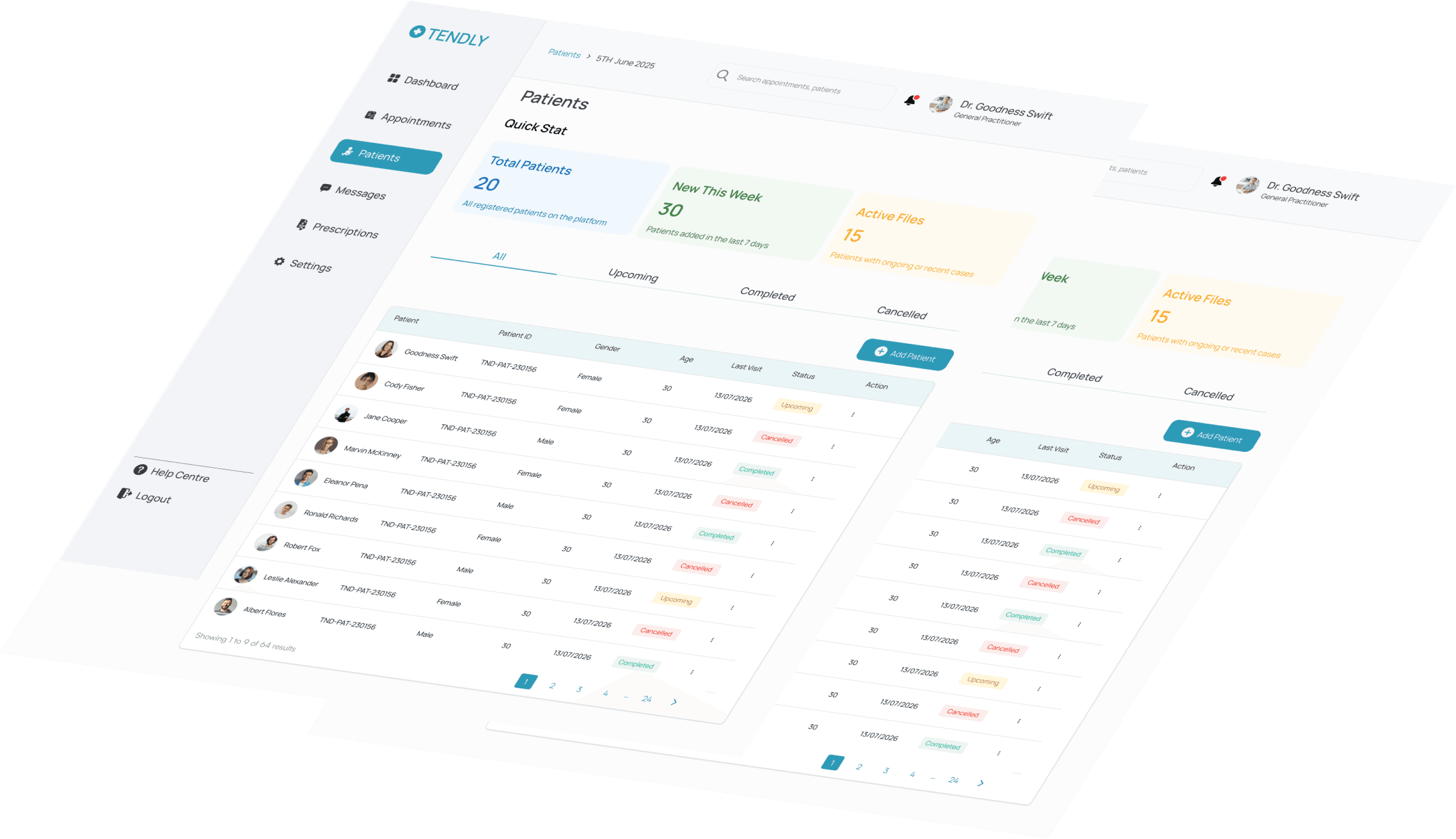
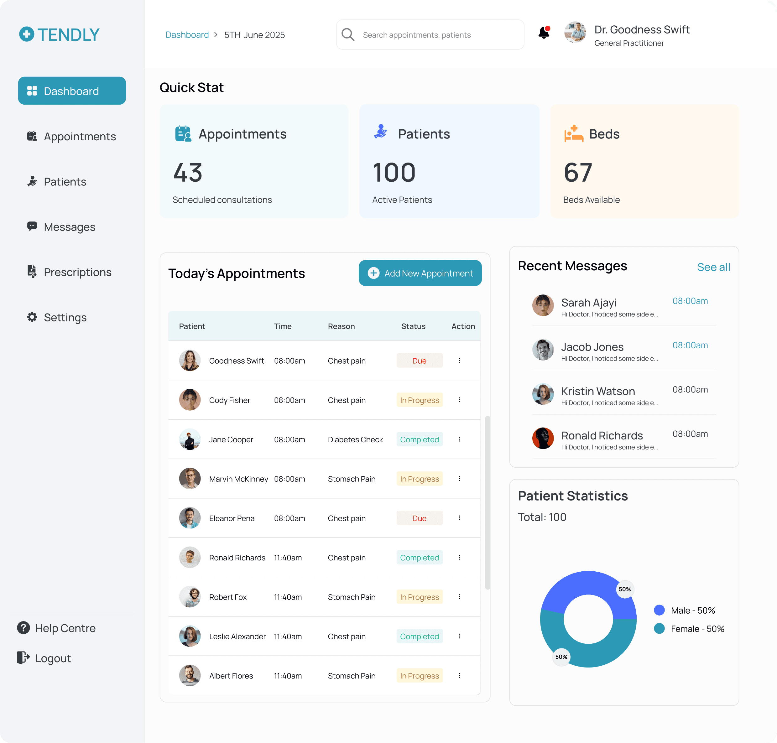
Doctor Dashboard (Web)
Doctor Dashboard (Web)
Doctor Dashboard (Web)
Goal: Give doctors a centralized view of their day at a glance.
Design Decisions:
Grouped quick stats (appointments, patients, beds) into visible cards for fast scanning
Added a clean table for “Today’s Appointments” with filters and actions
Included a messaging preview section to keep communication accessible
Designed a pie chart to visualize patient breakdown at a glance
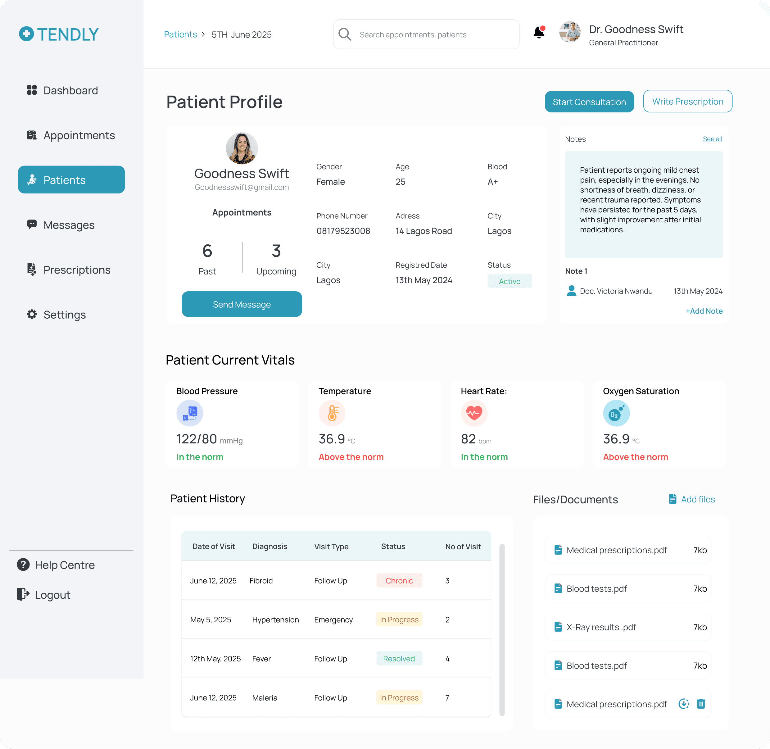
2. Patient Profile (Web Modal)
2. Patient Profile (Web Modal)
2. Patient Profile (Web Modal)
Goal: Allow doctors to access complete patient info without losing workflow context.
Design Decisions:
Used a modal overlay instead of full-page navigation to save time
Organized data into tabs: Medical History, Prescriptions, and Lab Results
Included a "Start Consultation" CTA for quick access
Goal: Allow doctors to access complete patient info without losing workflow context.
Design Decisions:
Used a modal overlay instead of full-page navigation to save time
Organized data into tabs: Medical History, Prescriptions, and Lab Results
Included a "Start Consultation" CTA for quick access
Goal: Allow doctors to access complete patient info without losing workflow context.
Design Decisions:
Used a modal overlay instead of full-page navigation to save time
Organized data into tabs: Medical History, Prescriptions, and Lab Results
Included a "Start Consultation" CTA for quick access
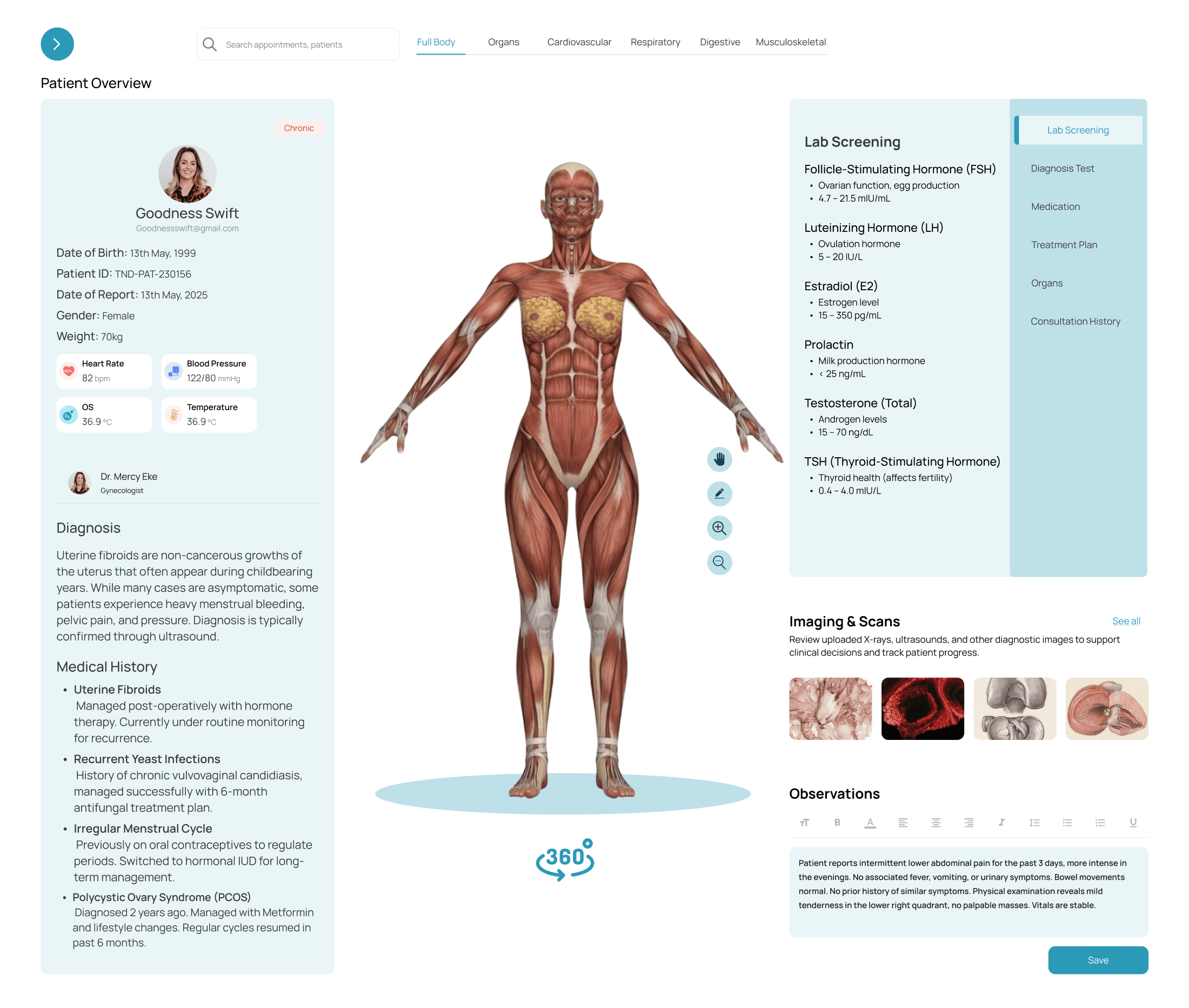
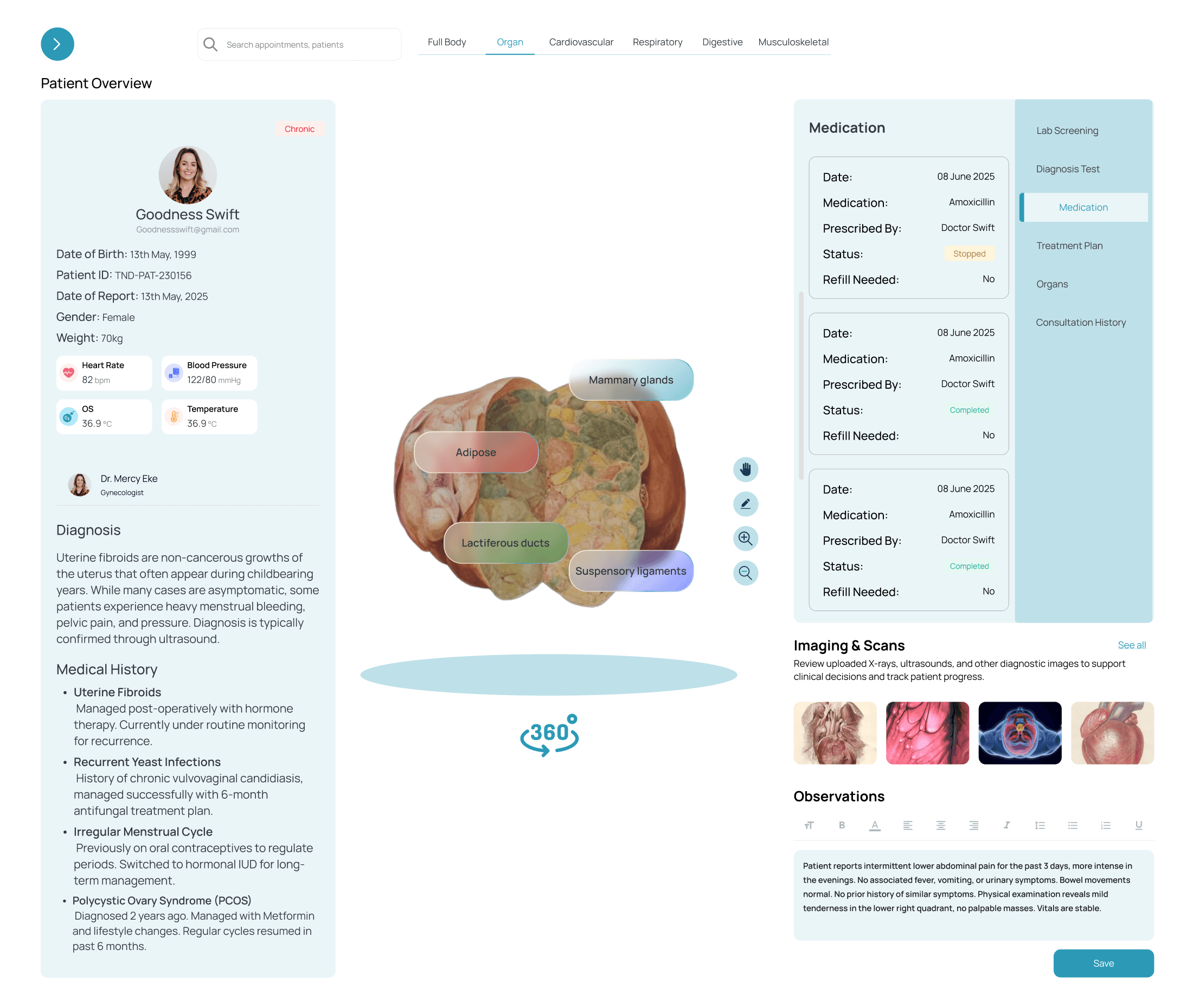
3. Start Consultation (Web)
3. Start Consultation (Web)
3. Start Consultation (Web)
Goal: Help doctors record session notes, observations, and next steps clearly.
Design Decisions:
Structured sections for vital signs, doctor’s observations, and diagnosis
Included summary cards for medical history and lab reports for reference
Enabled prescription actions directly from the consultation view
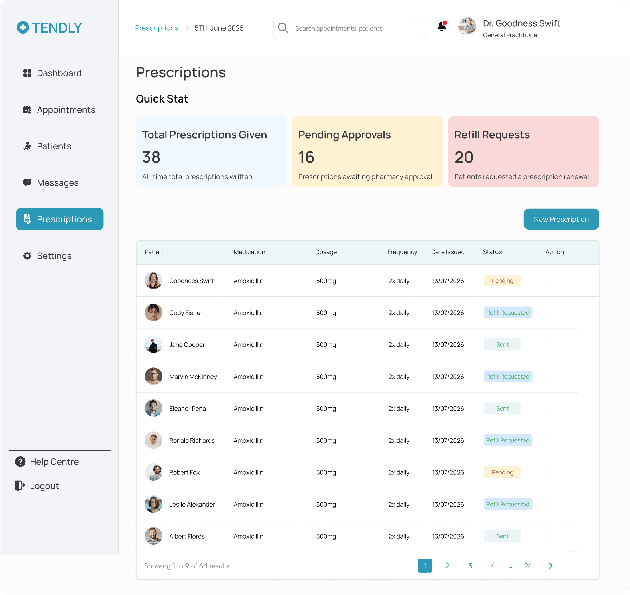
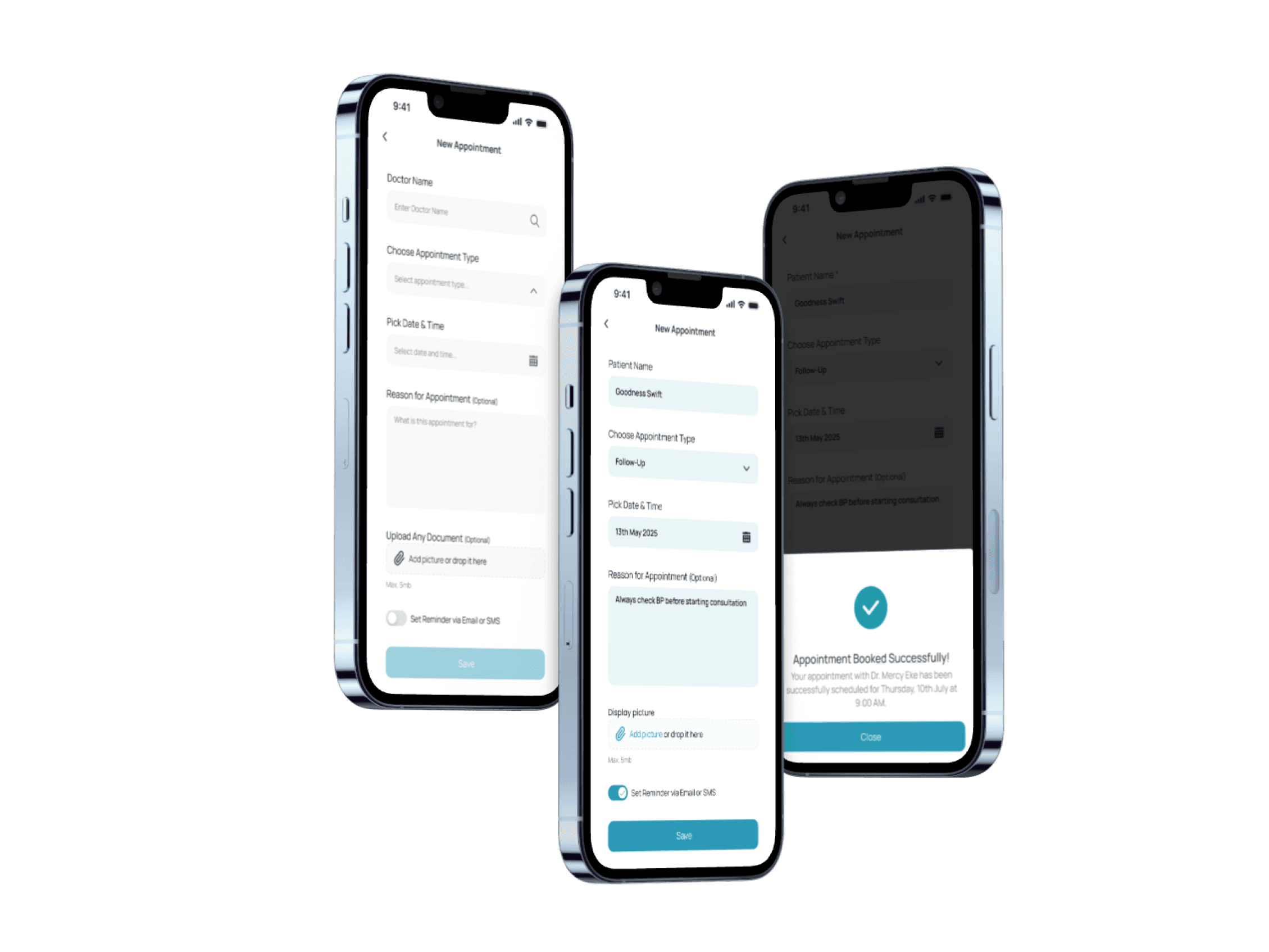
4. Prescription Screen (Web)
4. Prescription Screen (Web)
4. Prescription Screen (Web)
Goal: Simplify the creation and tracking of prescriptions.
Design Decisions:
Designed clean stat cards (e.g. Total Prescriptions, Fulfilled, Pending)
Used a table to track prescription history with filters
Created a modal form for “New Prescription” with drug name, dosage, and frequency
Added color-coded status tags for clarity
Samuel Adekunle
Age: 40
Occupation: Civil Engineer
Location: Lagos, Nigeria
User Type: Outpatient
Platform: Mobile
Bio
Samuel is a busy professional living in the city who manages a chronic health condition (hypertension). He has regular check-ups with his doctor and occasionally needs prescription renewals. Samuel is tech-savvy, prefers digital convenience, and values platforms that save him time. He doesn’t like hospital queues or calling clinics for updates.
Goals
Avoid hospital queues and unnecessary visits
Stay on top of his medication schedule
Track his health over time and feel in control of his treatment
Get timely support and follow-up care
Build a consistent, trusted relationship with his healthcare provider
Needs
A centralized digital platform to manage appointments, prescriptions, and messages
Easy access to his medical records and treatment history
Reliable appointment reminders and medication alerts
A way to communicate with his doctor remotely
Pain Points
Long wait times and poor communication from clinics
Forgetting appointment times or when to take medication
Inability to easily access lab results or past treatment records
Lack of transparency about treatment or prescriptions
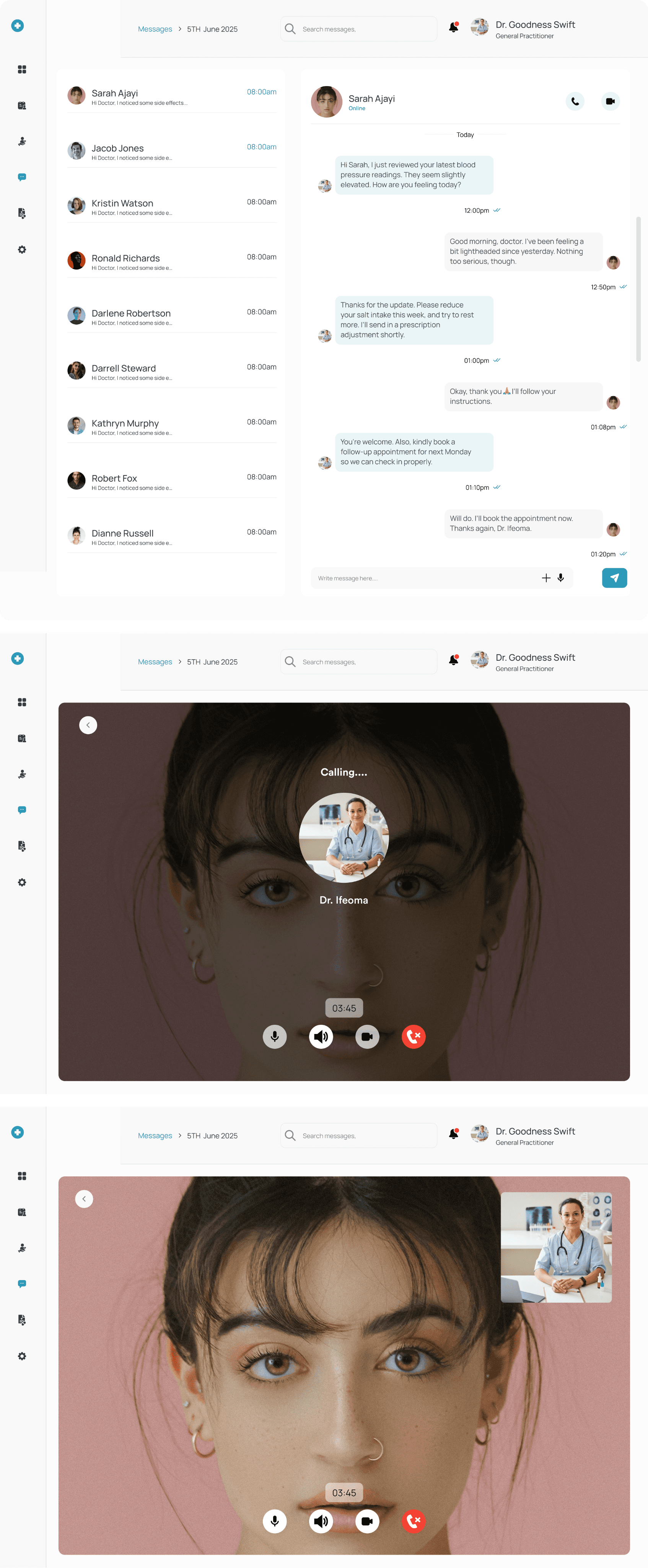
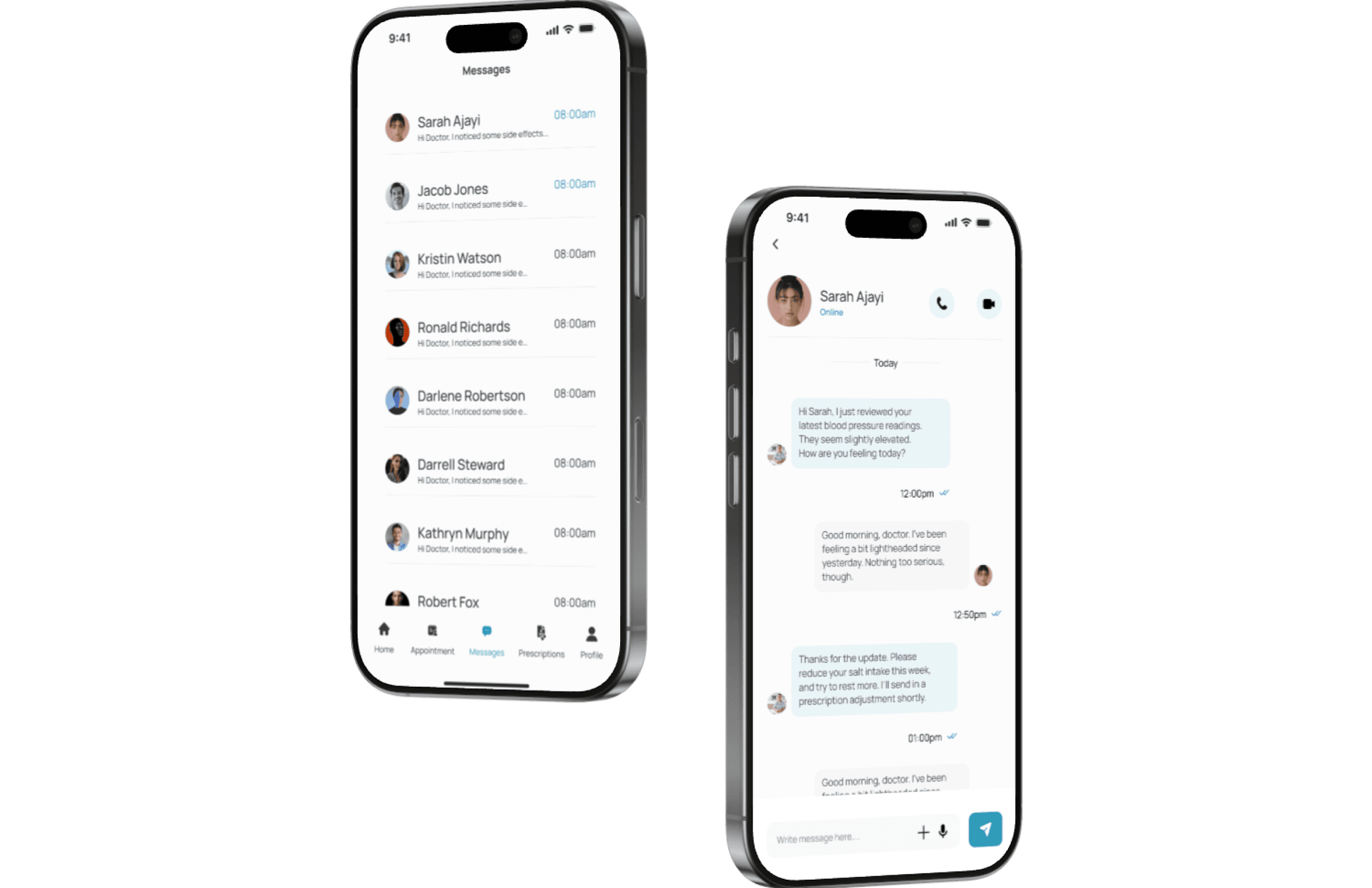
5. Messaging (Web)
5. Messaging (Web)
5. Messaging (Web)
Goal: Enable fast, secure communication between doctor and patient.
Design Decisions:
Simple, chat-style UI for real-time conversations
Highlighted unread messages
Grouped messages by patient for easy access
Goal: Enable fast, secure communication between doctor and patient.
Design Decisions:
Simple, chat-style UI for real-time conversations
Highlighted unread messages
Grouped messages by patient for easy access
Goal: Enable fast, secure communication between doctor and patient.
Design Decisions:
Simple, chat-style UI for real-time conversations
Highlighted unread messages
Grouped messages by patient for easy access
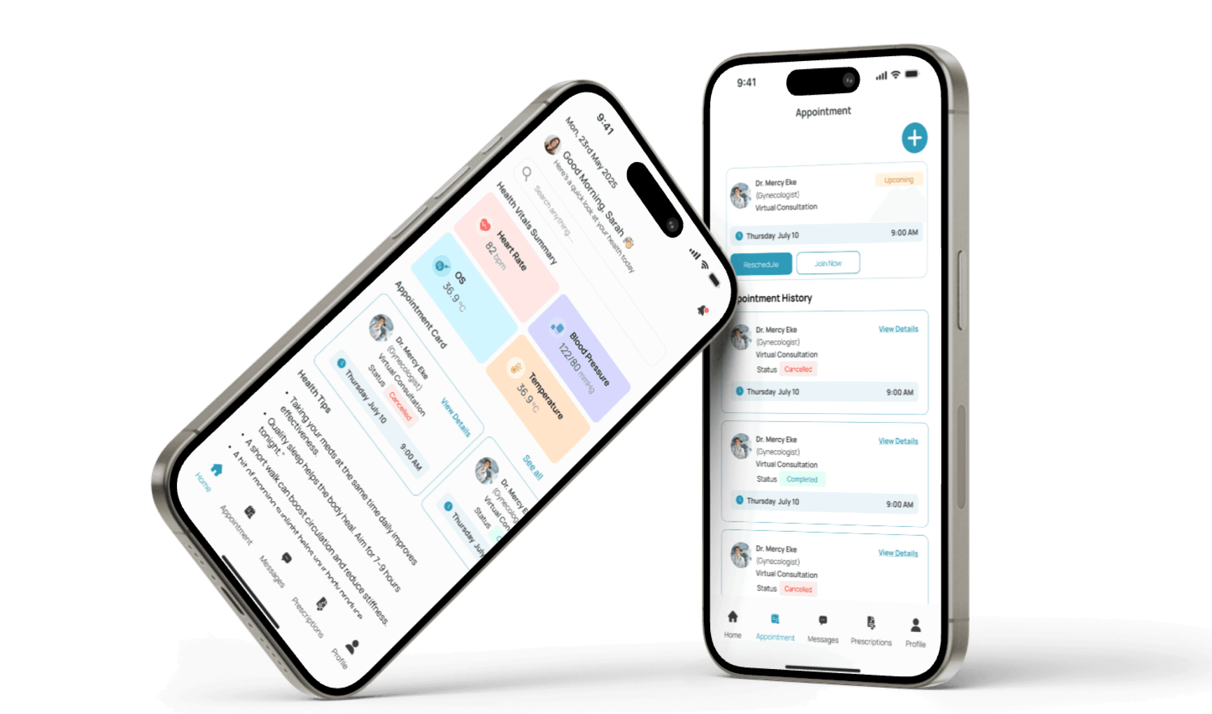
Patient Dashboard (Mobile)
Patient Dashboard (Mobile)
Patient Dashboard (Mobile)
Goal: Help patients manage appointments, prescriptions, and health tips easily.
Design Decisions:
Focused on a minimal, card-based layout for quick access
Included upcoming appointments, a health tip, and quick actions
Designed a persistent bottom navigation bar for smooth flow
Goal: Help patients manage appointments, prescriptions, and health tips easily.
Design Decisions:
Focused on a minimal, card-based layout for quick access
Included upcoming appointments, a health tip, and quick actions
Designed a persistent bottom navigation bar for smooth flow
Goal: Help patients manage appointments, prescriptions, and health tips easily.
Design Decisions:
Focused on a minimal, card-based layout for quick access
Included upcoming appointments, a health tip, and quick actions
Designed a persistent bottom navigation bar for smooth flow
7. Patient Chat Interface (Mobile)
7. Patient Chat Interface (Mobile)
Goal: Make it easy for patients to ask questions and stay in touch with their doctor.
Design Decisions:
Real-time chat interface for follow-up conversations
Simple layout with message timestamps and read status
Included option for patients to view past chats and send attachments (e.g., test results or photos)
Designed to be lightweight, responsive, and familiar (like WhatsApp-style UX)
Conclusion & Learnings
Conclusion & Learnings
Designing Tendly was more than just a visual exercise — it was a deep dive into how healthcare professionals and patients interact with digital tools in high-stakes environments.
By focusing on clarity, speed, and simplicity, I was able to design a system that supports doctors in managing their day more efficiently, while giving patients greater control over their health — all in one connected platform.
Key Learning
Real-world context matters
Designing for healthcare means understanding real constraints — time, stress, and high responsibility. Every design decision had to reflect that urgency.
Balance is everything
I had to balance business goals, user needs, and technical feasibility — a skill I continue to strengthen through product thinking.
Mobile vs. Web requires different mindsets
Designing for doctors (desktop) and patients (mobile) required two completely different UX approaches. Contextual clarity was key.
Small touches go a long way
Quick stats, modal views, and feedback states improved usability significantly — and reminded me that great UX is often invisible.
Thank You For Reading
Thank You For Reading
Conclusion & Learnings
Designing Tendly was more than just a visual exercise — it was a deep dive into how healthcare professionals and patients interact with digital tools in high-stakes environments.
By focusing on clarity, speed, and simplicity, I was able to design a system that supports doctors in managing their day more efficiently, while giving patients greater control over their health — all in one connected platform.
Key Learning
Real-world context matters
Designing for healthcare means understanding real constraints — time, stress, and high responsibility. Every design decision had to reflect that urgency.
Balance is everything
I had to balance business goals, user needs, and technical feasibility — a skill I continue to strengthen through product thinking.
Mobile vs. Web requires different mindsets
Designing for doctors (desktop) and patients (mobile) required two completely different UX approaches. Contextual clarity was key.
Small touches go a long way
Quick stats, modal views, and feedback states improved usability significantly — and reminded me that great UX is often invisible.
Thank You For Reading